Clash Charts: clash visibility without the workarounds
Are you prepared for what’s next in AECO?
In complex coordination environments, visibility into clash status is essential. Project teams need to understand resolution trends. Stakeholders need confidence that coordination is progressing. BIM and VDC managers need reporting that reflects reality without manual intervention.
Traditionally, getting clash data into Revizto's dashboards has meant publishing every clash as an issue first, then relying on issue-based charts to tell the story. Teams also had the option of manually exporting clash results from the Revizto application into Excel spreadsheets and feeding those into their own dashboards, adding yet another layer of manual overhead. Clash Charts in Workspace eliminates both of these workarounds, giving teams direct visibility into clash trends without the need to republish clashes as issues or maintain external spreadsheets.
What are Clash Charts and how do they work?
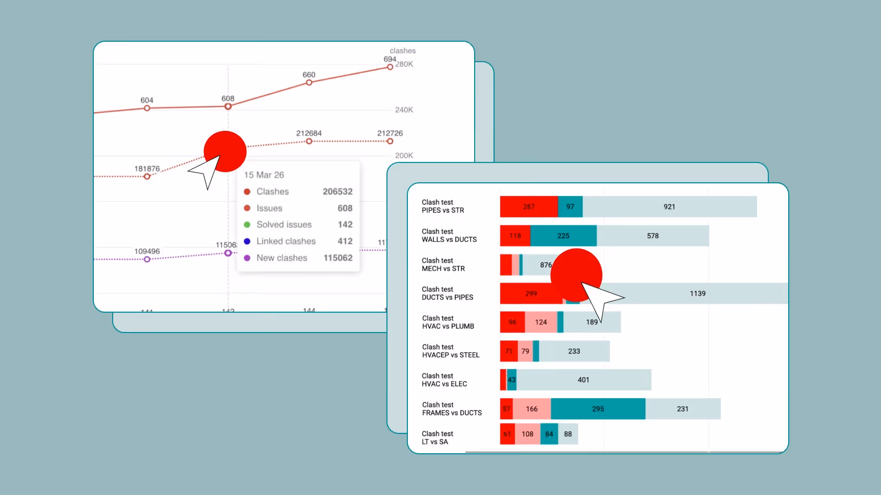
Clash Charts in Revizto Workspace allows teams to visualize clash data directly in dashboard charts without converting clashes into issues first, or relying on manual Excel exports. Instead of routing everything through the Issue Tracker, clash information flows directly into the same dashboards teams are already using for project reporting, giving coordination leads and stakeholders immediate access to the data they need. These are not limited or simplified views either. Clash Charts support the full range of dashboard chart types and are fully configurable right inside Workspace. Behind the scenes, a new Clash API powers the data that feeds these charts, and that same API is also available to teams that want to take clash data further into PowerBI, custom tools, or their own integrations.
Clash Charts support the full range of dashboard chart types:
- Pie and Doughnut charts for status breakdowns
- Bar charts for discipline or level comparisons
- Timeline charts that can display issues and clashes together on the same axis, giving a unified view of coordination progress over time.
Each dashboard carries its own clash filters alongside issue filters, so teams can scope what is shown to specific levels, disciplines, clash tests, or whichever conditions matter to the project. For teams using the new ‘Group by Search Set’ feature in Clash Automation, this becomes even more powerful. Groups created through Search Set conditions flow directly into dashboard reporting, meaning the same logical structure used to organize clashes in Clash Automation is immediately reflected in project-level charts without any additional configuration. This ensures the right people see the right data without needing access to Clash Automation itself.
The Clash API is also available for those wanting to funnel their data to other tools or custom built applications.
Where Clash Charts make the greatest difference
With access rights in Clash Automation, team members can review and resolve clashes on their own without waiting for a coordinator to hand out work. Clash Charts means progress is still visible to everyone who needs it, helping coordination leads track resolution trends without being involved in every step. This is where Clash Charts can make the greatest difference: Because clash data flows directly into dashboards, the Issue Tracker is able to remain focused on actual issues, while coordination reporting takes care of itself.
Clash Charts enable cleaner workflows and better visibility. They reduce administrative overhead, remove unnecessary steps from coordination reporting, and ensure that clash data is accessible to the people who need it, when they need it, without manual effort in between.
Clash Charts is available now in Revizto Workspace.